Styling Changes
Hello, I'm Geneva Regpala and I'm a senior computer science student at CSUB. I am well-versed in front-end web design, so I implemented front-end design for the MeXanimator website. The original project website had bare bones and was just a white background with black text. There was no custom theme, so I created styling changes that follow the theming of the MeXanimator Blog Post page.
The MeXanimator Blog page runs on Ghost, an open-source publishing platform built for modern content creators. It uses Ghost's default Casper theme, which features a clean dark aesthetic with high-contrast typography, prominent use of black and dark gray backgrounds, and a signature yellow accent color for interactive and highlighted elements. Casper also makes use of the Barlow Condensed typeface, generous whitespace, and bold section headings to give the blog a polished editorial feel. Maintaining visual consistency between the blog and the backend account management interface is important because they are two entirely separate pieces of software: the blog runs on Ghost, while the account management system is a custom-built web application. Visitors and administrators who move between the two should experience a coherent visual identity rather than a jarring shift in style.
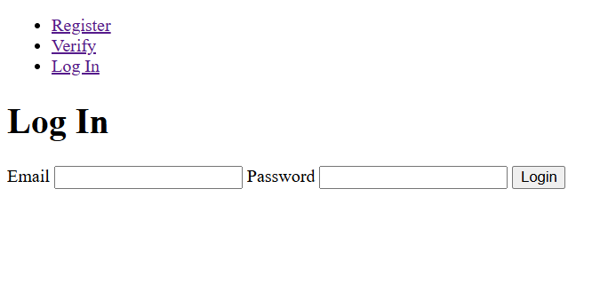
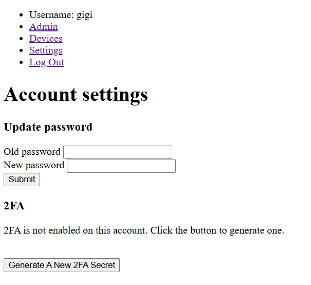
Starting off, I orginally only had access to a few pages, so I styled it based off what I could see and adjust. I wrote classes and tried to make the styling universal in a way where each component can pull from the same palette. The default font was replaced by a Google Fonts import to match the font of the MeXanimator page.
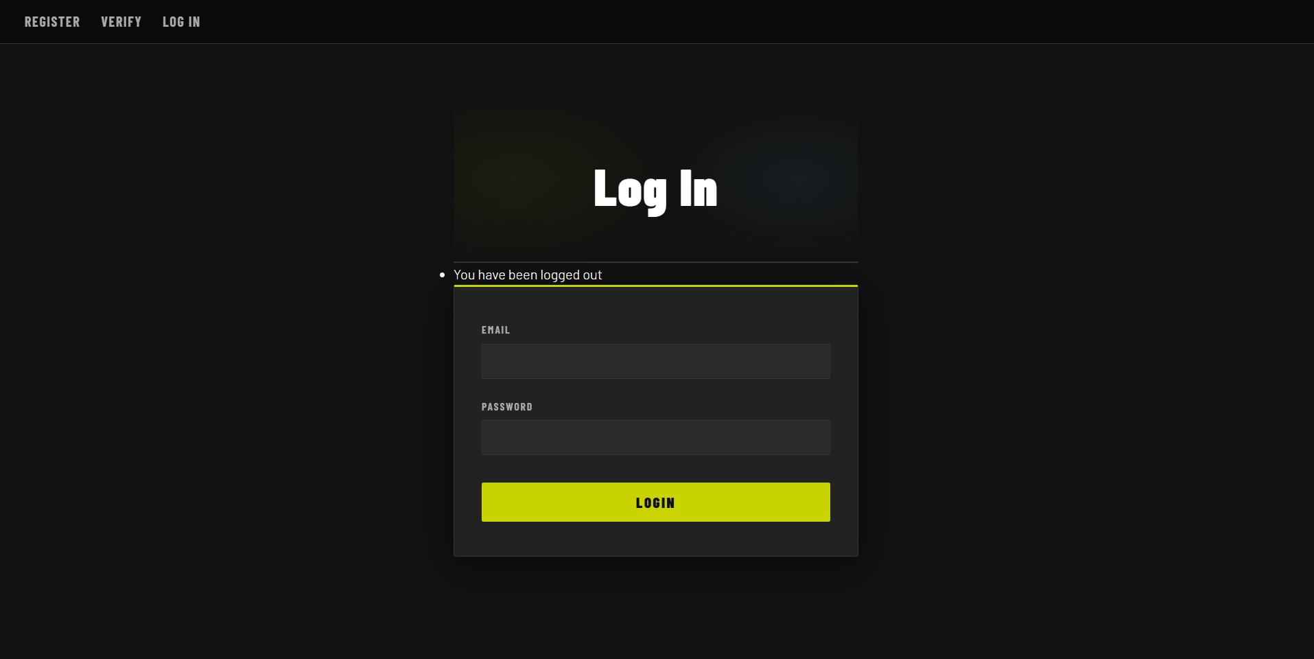
The navigation originally looked like a list of links, but now it is a fixed nav bar with a dark background to match the theming of the MeXanimator webpage. There is also a subtle border along the bottom of the navbar to separate it from the page.
Forms went from invisible to one of the most visually distinctive parts of the interface. Each form is now wrapped in a dark card with a one-pixel border and a three-pixel accent stripe running along the top edge in the signature yellow color. This top stripe became a repeated motif used across tables, section headings, and later the modal, tying every component back to the same visual language.
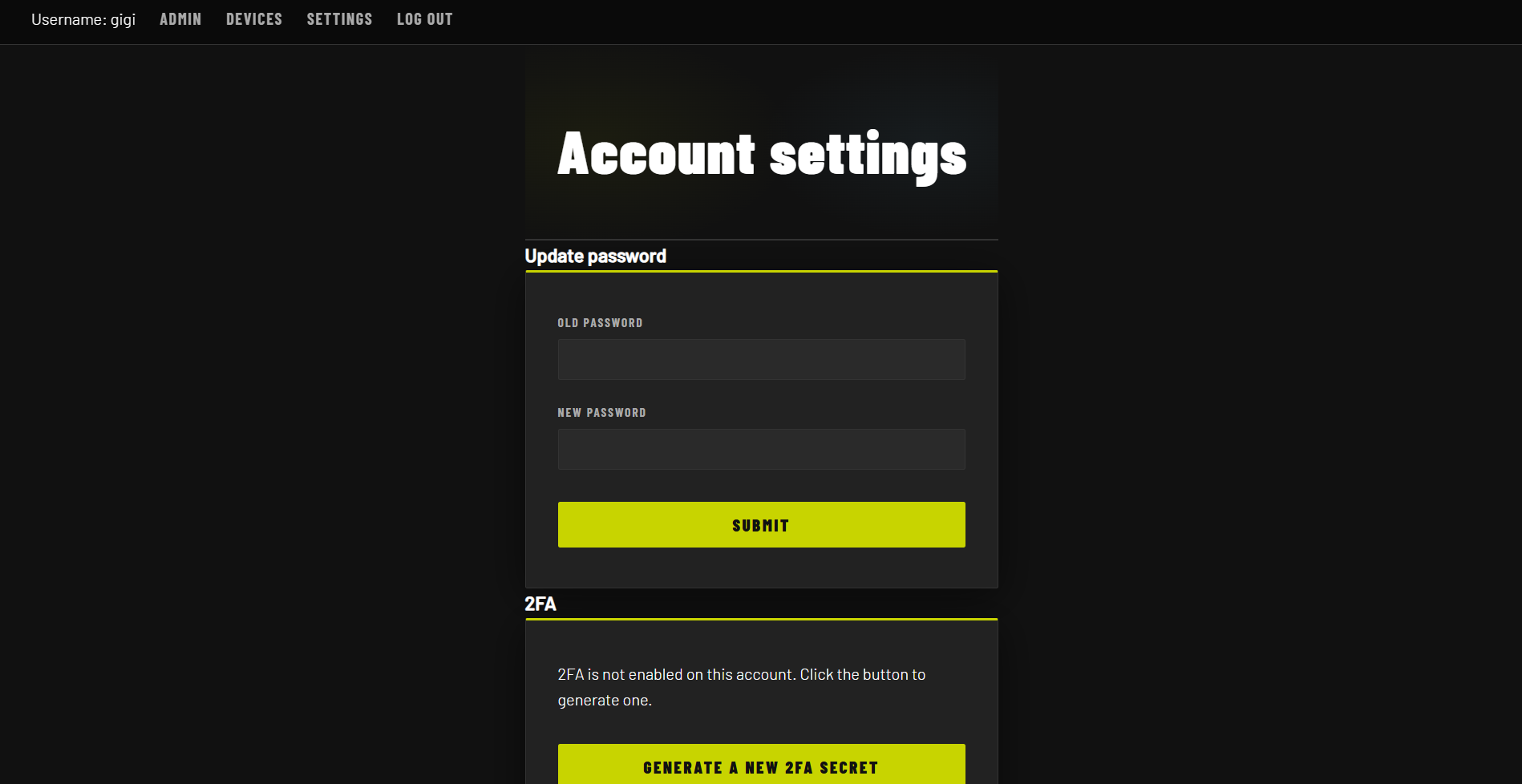
The white browser-default input elements were replaced with dark background-color values matching the card surface, a custom border-color, and a focus state that activates a yellow border and a soft glow using box-shadow. The submit button transformed from a gray browser widget into a full-width solid yellow button with heavy Barlow Condensed text, a hover glow effect, and a subtle press animation on click.
Tables needed the most structural work because they appear on several admin pages and contain dense information. Previously, wide table elements would overflow horizontally outside their container, causing content to run off the edge of the viewport and forcing users to scroll the entire page rather than just the table region. This was especially problematic for columns containing long strings like recording IDs or timestamps. To fix this, a div wrapper element was introduced around every table. The wrapper provides a dark card background, a border, and sets overflow-x: auto, enabling horizontal scrolling scoped to the table area alone. This keeps the overall page layout intact on smaller screens while still making all columns accessible, a straightforward responsive design improvement.
Several utility classes were introduced for specific cell types. Date td cells are rendered in a smaller muted style. ID td cells use a font-family: monospace to make hash strings more readable. Action td cells containing buttons are kept tight with white-space: nowrap so control buttons always sit on a single line.
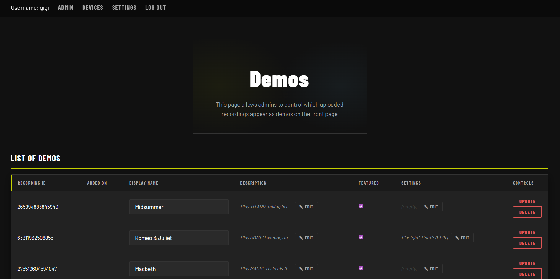
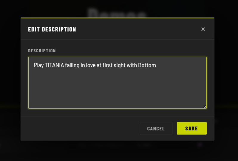
The latest addition was a full modal system built to replace the textarea fields inside the demo management tables. Rather than editing long text directly in a cramped table cell, users now click a small edit button to open a focused modal overlay. The modal is implemented entirely in vanilla JavaScript and CSS, with no external libraries. A click event listener on the edit button sets a CSS class on the overlay div to toggle its visibility, while the backdrop uses a semi-transparent background-color combined with backdrop-filter: blur() for the frosted-glass effect. Closing the modal is handled by a second event listener attached to the backdrop itself, so clicking outside the card dismisses it. The modal card follows the same pattern as form cards: dark background, one-pixel border, and the three-pixel yellow border-top stripe.
TODO: put backticks `` in front of any HTML / CSS keywords. Just one on each side of the word should make it preformatted. Markdown FTW.
TODO: describe modal logic as purely JS and CSS, no libraries.
Inside the modal, the textarea inherits the same dark input styling used elsewhere in the interface, including the yellow outline focus ring. The edit button that triggers the modal is a small uppercase text button sitting next to a truncated preview of the current field value. On hover it picks up the yellow color and border, consistent with every other interactive element in the interface. The hidden input behind it carries the actual value through the form submission, so the modal is purely a UX layer on top of the existing form structure.
Overall, the page has really come a long way from the previous bare bones it once was. There is now a structured palette to pull styles from to give the webpage some consistency stylewise. Anyways, it was great working on the project and I'm happy to have contributed in the ways that I could.